Installation
Learn how to install and set up the Moment theme on your Shopify store.
Steps to Install
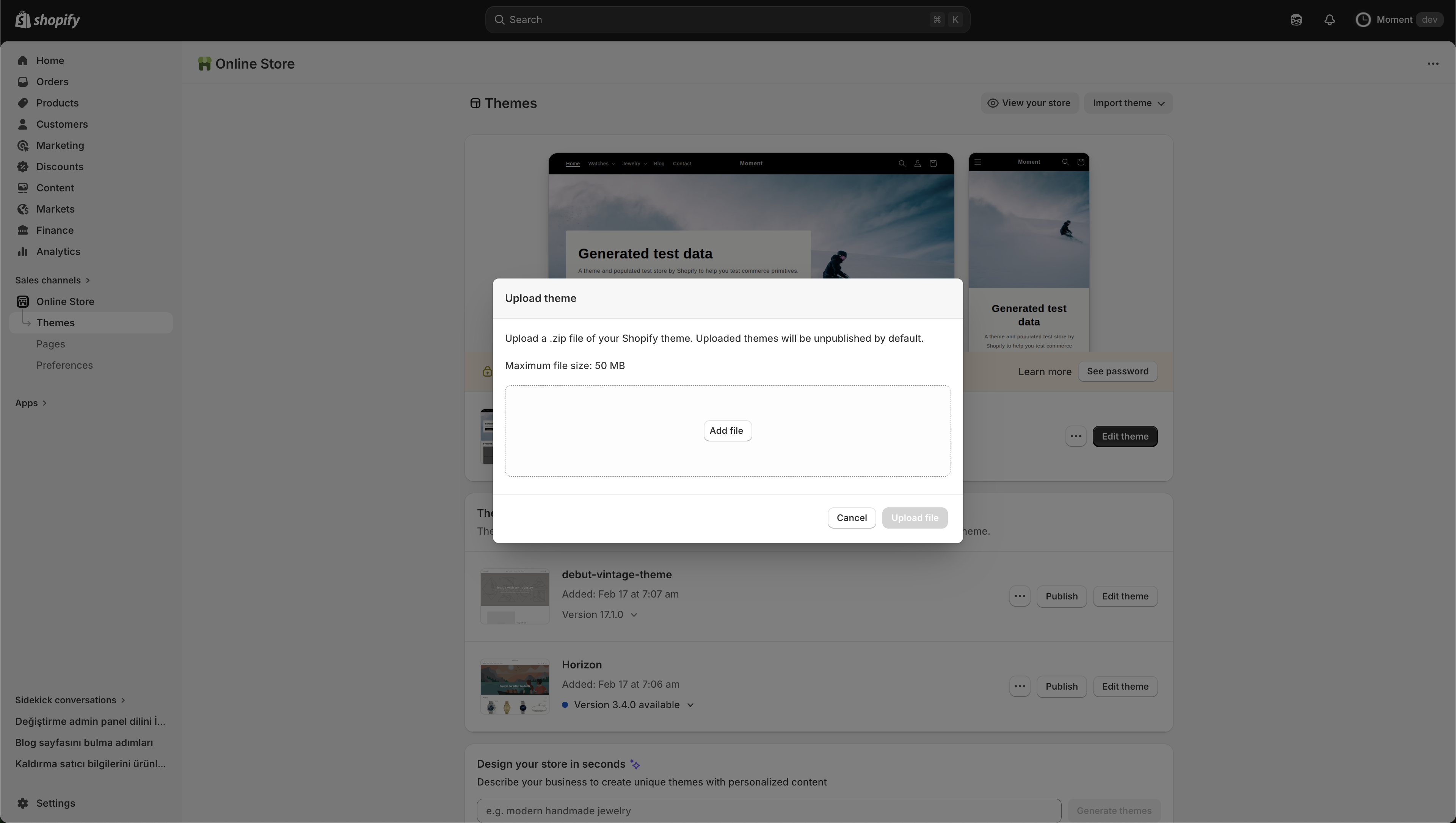
- Log in to your Shopify Admin dashboard.
- Navigate to Online Store > Themes in the left sidebar.
- In the Theme Library section, click on the Add theme dropdown and select Upload zip file.
- In the pop-up window, click Add file and select the downloaded Moment theme `.zip` file from your device.
- Click Upload file to finish adding the theme to your library.
Configuration
Configure your Moment theme settings for the best experience.
Theme Customizer
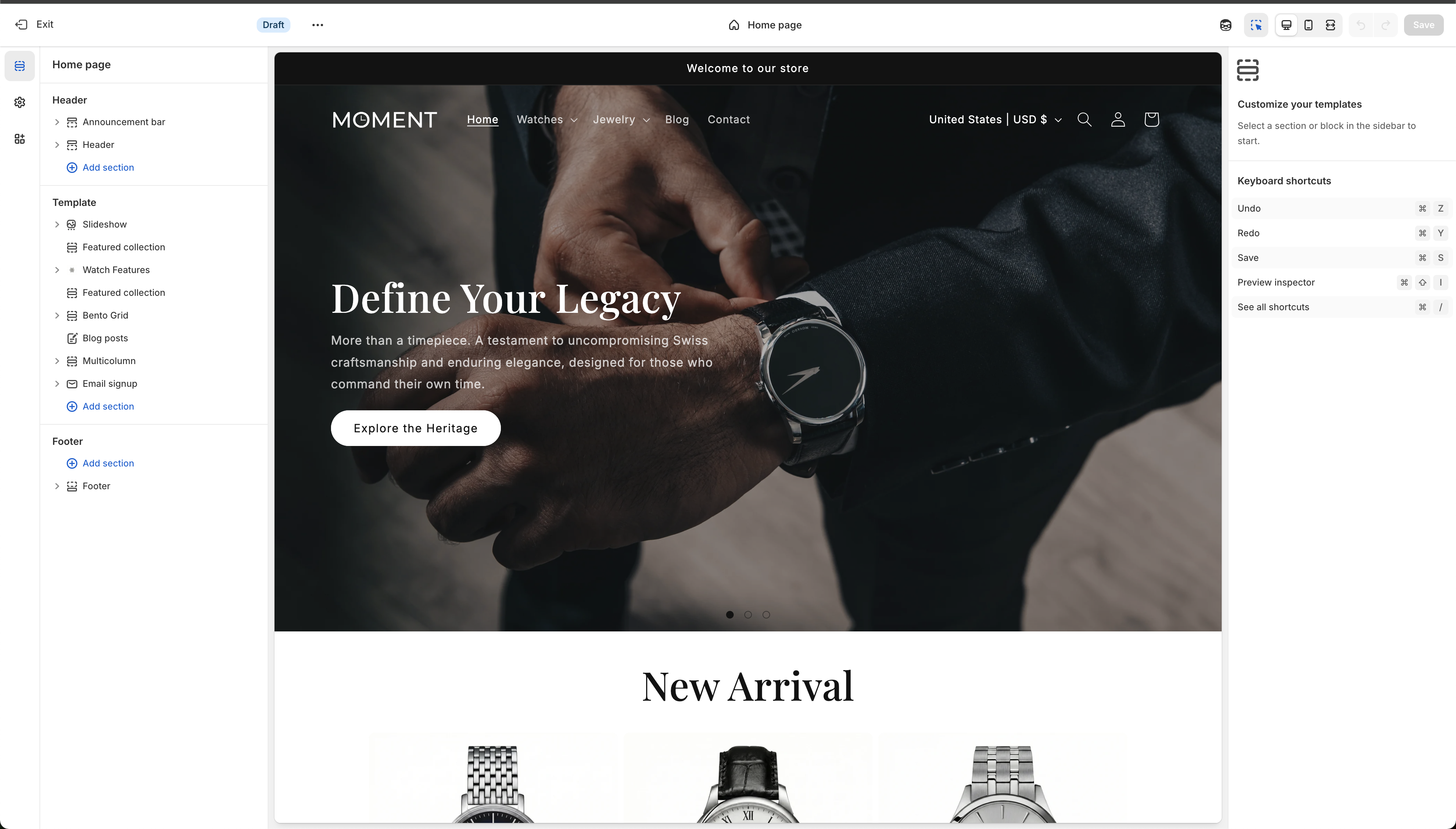
Once installed, click the Customize button next to the Moment theme to open the Shopify Theme Customizer. This is your main workspace where you will build and adjust your storefront.
- Sections Panel (Left Sidebar): Add, remove, and reorder sections across different templates (Home page, Product pages, etc.).
- Preview Area (Center): See real-time changes as you build. You can toggle between desktop, mobile, and full-screen views.
- Settings Panel (Right Sidebar): When you click on a section or block, its specific settings will appear here.
- Theme Settings (Gear Icon): Switch to the global theme settings on the left edge to control broader elements like colors, typography, layout globally.
Keyboard Shortcuts
Speed up your workflow using the following shortcuts in the customizer:
- Undo: `⌘ Z` (Mac) or `Ctrl Z` (Windows)
- Redo: `⌘ Y` (Mac) or `Ctrl Y` (Windows)
- Save: `⌘ S` (Mac) or `Ctrl S` (Windows)
- Preview Inspector: `⇧ ⌘ I` (Mac) or `Shift Ctrl I` (Windows)
Header
Customize the main navigation area of your store, including the logo, menus, and utilities.
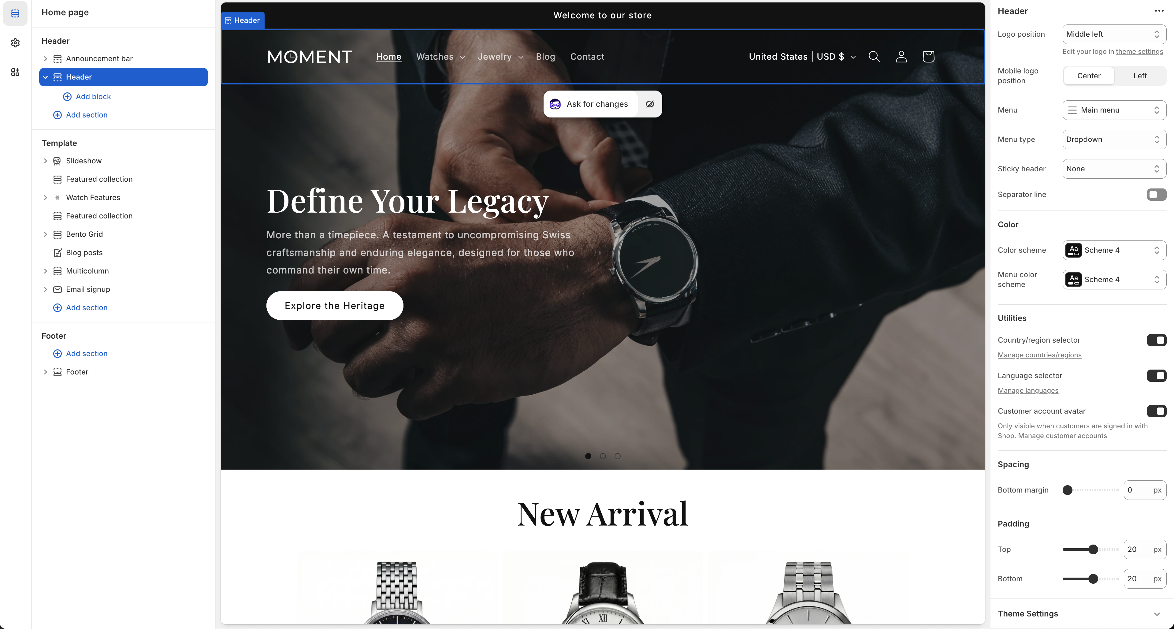
Settings
- Logo position: Choose where your logo appears on desktop (e.g., Middle left).
- Mobile logo position: Set the position of the logo specifically for mobile devices (Center or Left).
- Menu: Select the primary navigation menu to display.
- Menu type: Define the interaction style for sub-menus (e.g., Dropdown).
- Sticky header: Configure the header's behavior when scrolling down the page.
- Separator line: Toggle a visual divider at the bottom of the header.
Color
- Color scheme: Apply a specific color scheme to the main header area.
- Menu color scheme: Optionally set a different color scheme specifically for the dropdown menu area.
Utilities
- Country/region selector: Enable customers to choose their location/currency.
- Language selector: Allow visitors to switch between available languages.
- Customer account avatar: Display an avatar icon, visible only when customers are signed in with Shop.
Spacing & Padding
- Bottom margin: Adjust space below the header block.
- Top / Bottom padding: Fine-tune the internal vertical spacing of the header itself.
Announcement Bar
Configure the global announcement messages at the very top of your store.
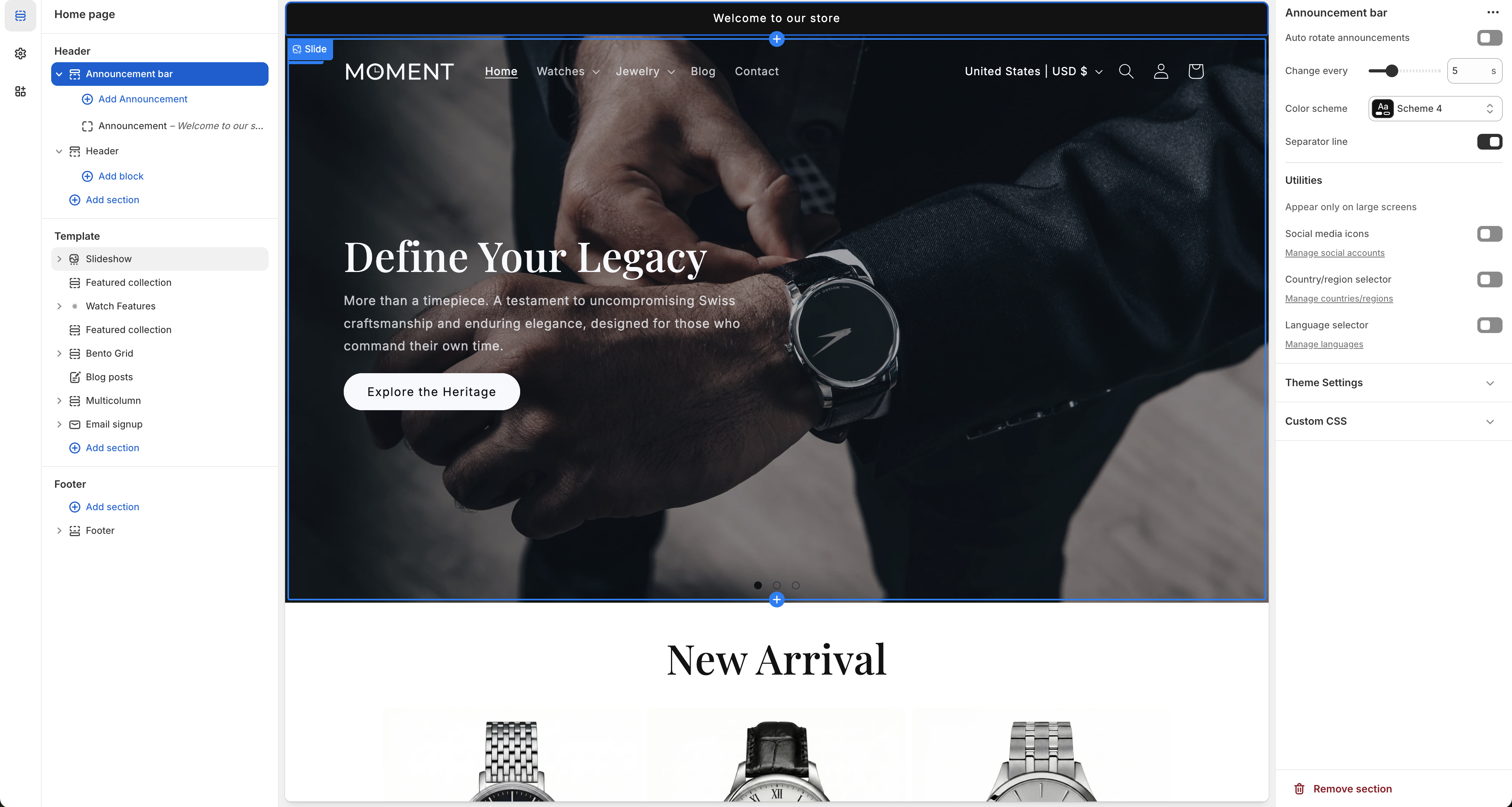
Settings
- Auto rotate announcements: Toggle whether multiple announcement messages should automatically rotate like a carousel.
- Change every: Set the rotation speed in seconds (e.g., 5s).
- Color scheme: Apply a specific color palette matching your design.
- Separator line: Show a line below the announcement bar to separate it visually from the header.
Utilities
- Appear only on large screens: Optionally hide the announcement bar on mobile devices.
- Social media icons: Display links to your social media accounts.
- Country/region selector: Provide a location and currency dropdown directly in the announcement bar.
- Language selector: Allow visitors to switch languages from the top bar.
Slideshow
Highlight your main campaigns, features, or collections through a dynamic image slider.
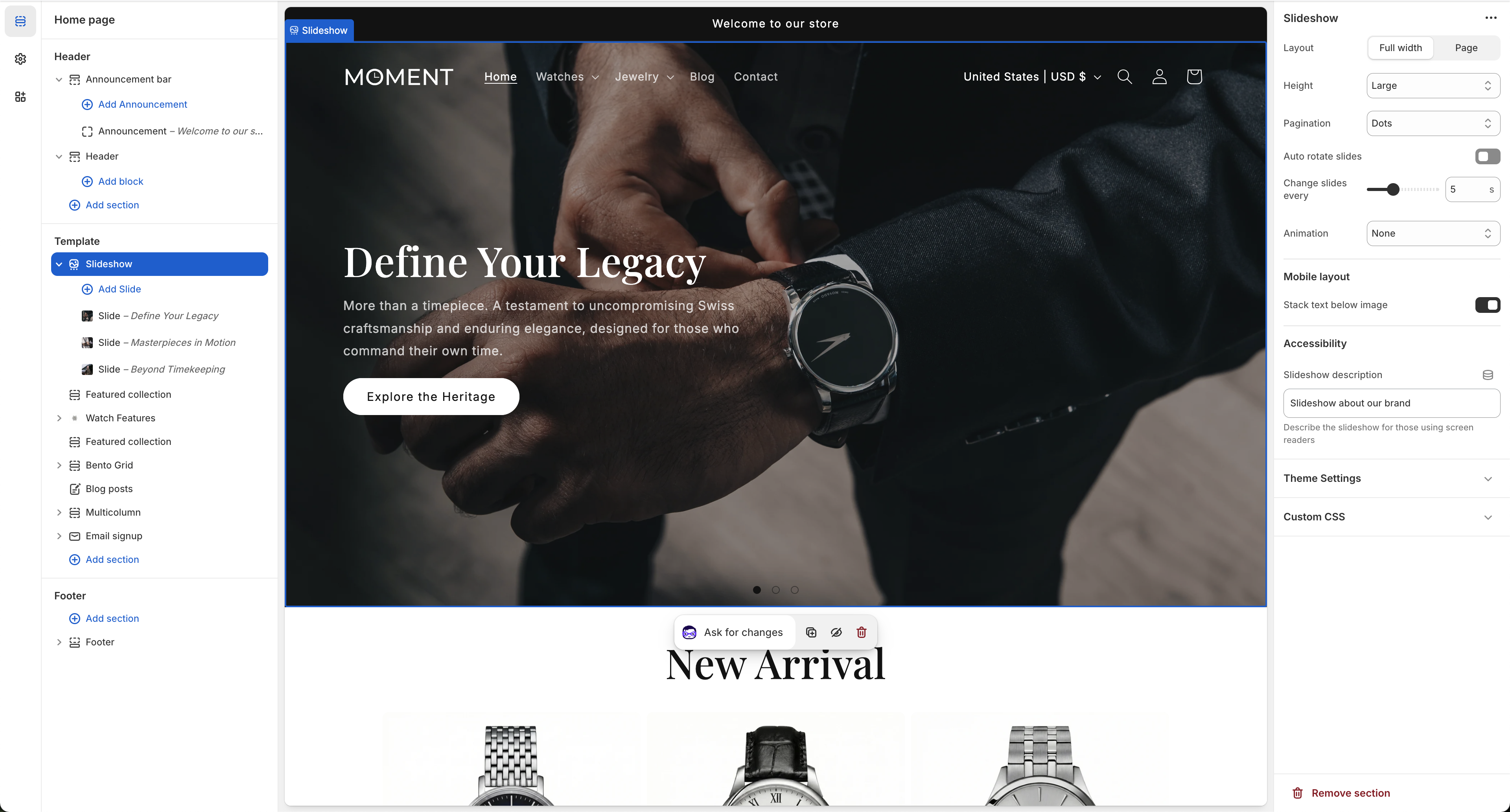
Settings
- Layout: Define whether the slideshow spans the full width of the screen or respects the page container width.
- Height: Set the vertical size of the slides (e.g., Small, Medium, Large).
- Pagination: Choose the style for the slide indicators (e.g., Dots).
- Auto rotate slides: Enable automatic transition between slides.
- Change slides every: When auto-rotation is on, select the transition delay in seconds.
- Animation: Set the transition effect type (e.g., Slide, Fade, or None).
Mobile Layout
- Stack text below image: On smaller screens, separate the embedded text from the image for better readability.
Accessibility
- Slideshow description: Add descriptive text for screen readers explaining the context of the slideshow.
Product Grid
Set up product grid layouts, card styles, and filtering options.
📝 Documentation content will be added here.
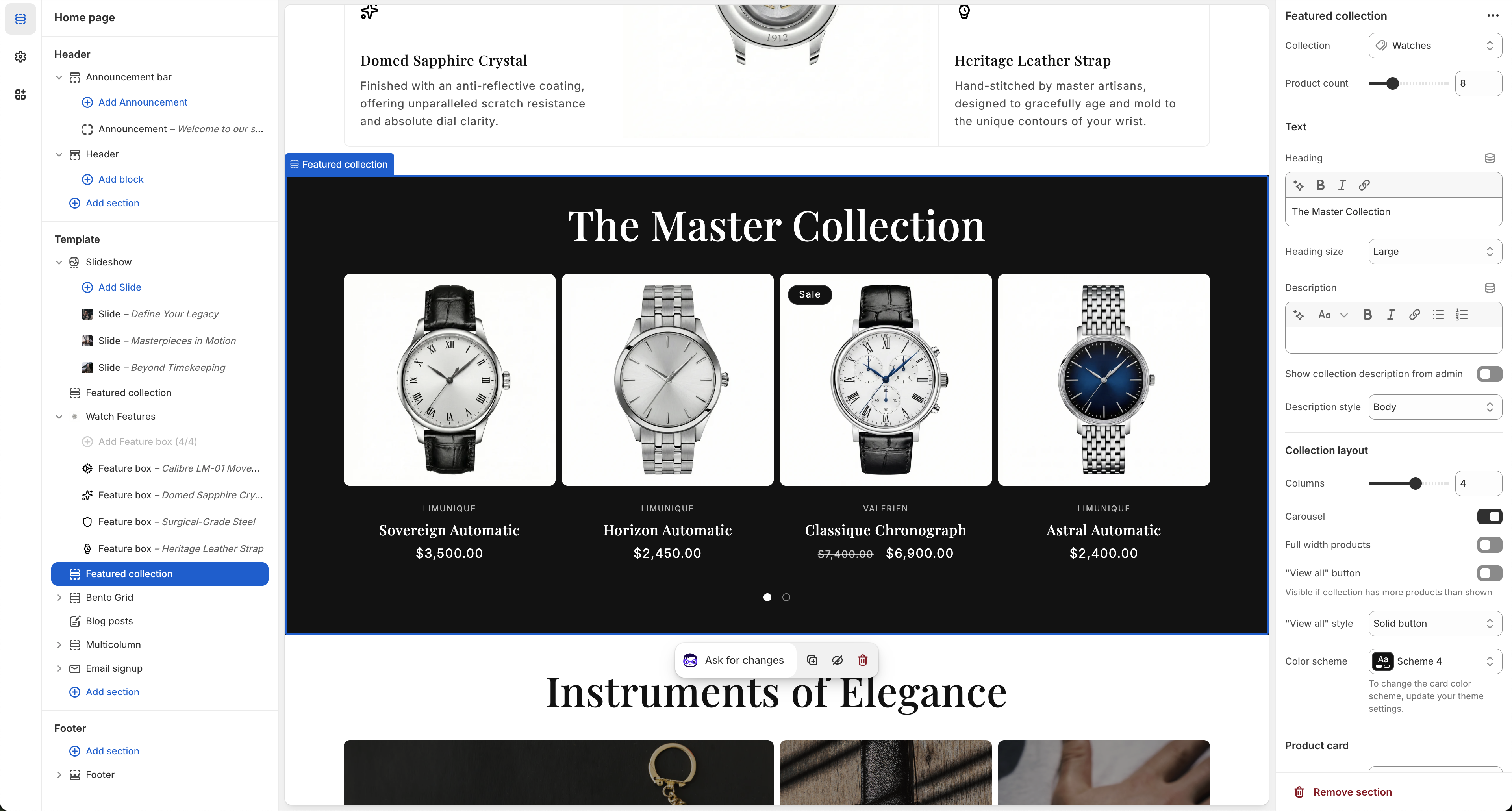
Featured Collection
Highlight specific collections (like "New Arrivals") on your homepage and landing pages.
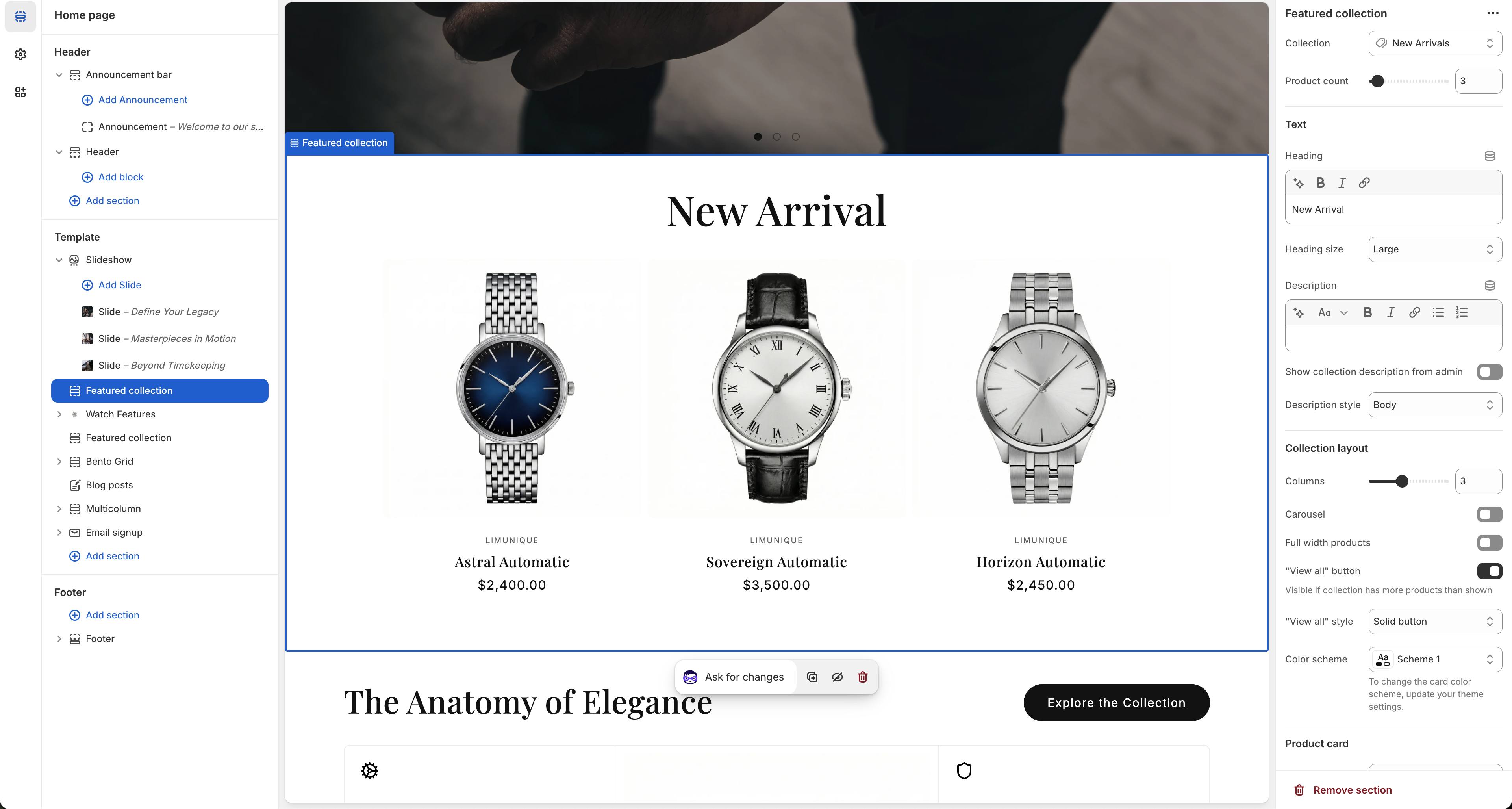
Data source
- Collection: Select the specific collection to display (e.g., New Arrivals).
- Product count: Set the maximum number of products to show in this section.
Text
- Heading: Enter a title for the section (e.g., "New Arrival").
- Heading size: Choose the display size for the primary heading.
- Description: Add a subtitle or paragraph text directly below the heading.
- Show collection description from admin: Automatically pull the description from your Shopify collection settings instead of entering it manually.
- Description style: Set the typographic style for the description block.
Collection layout
- Columns: Configure how many product columns appear side-by-side on desktop views.
- Carousel: Turn the product grid into a swipeable carousel slider.
- Full width products: Extend product cards to fill the entire horizontal space without side margins.
- "View all" button: Enable a button linking to the full collection page (visible if the collection has more products than the "Product count" setting).
- "View all" style: Select the visual style for the button (e.g., Solid button).
- Color scheme: Apply a unique background and text color scheme to this block.
Watch Features
Highlight the specific details and characteristics of a particular product using a split-layout design.
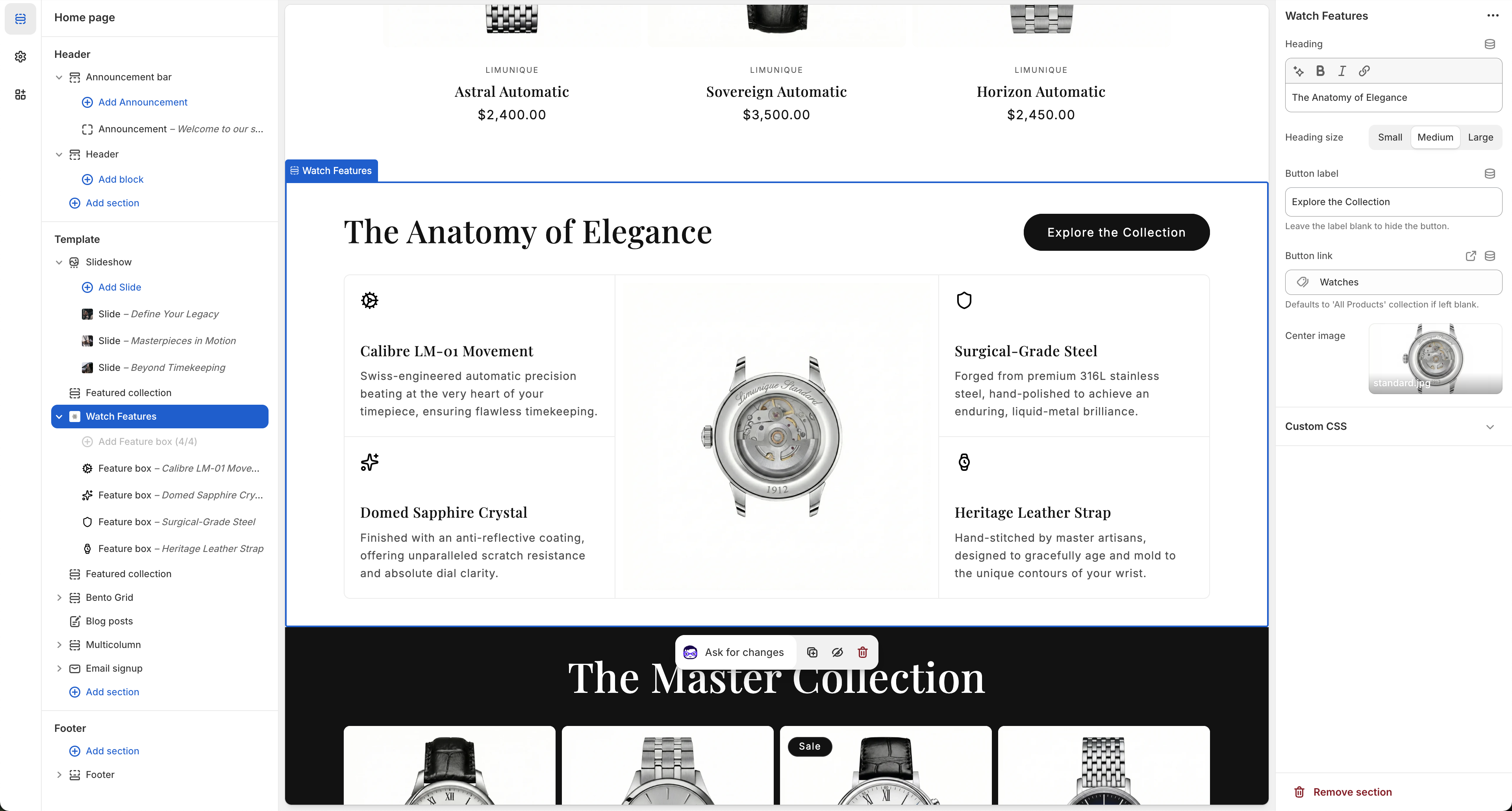
Heading
- Heading: The main title representing the feature block (e.g., "The Anatomy of Elegance").
- Heading size: Choose between Small, Medium, or Large for the main title.
Button
- Button label: Add a descriptive label to prompt the user (e.g., "Explore the Collection"). Leave blank to hide the button.
- Button link: Define where the button takes the user. Defaults to "All Products" if left empty.
Center Image
- Center image: Upload an image that acts as the focal point between the textual feature lists.
Feature Blocks (Blocks)
Add individual text snippets (Feature box) with an icon, title, and paragraph on either side of the center image to describe specific parts or specifications (e.g., "Calibre LM-01 Movement").
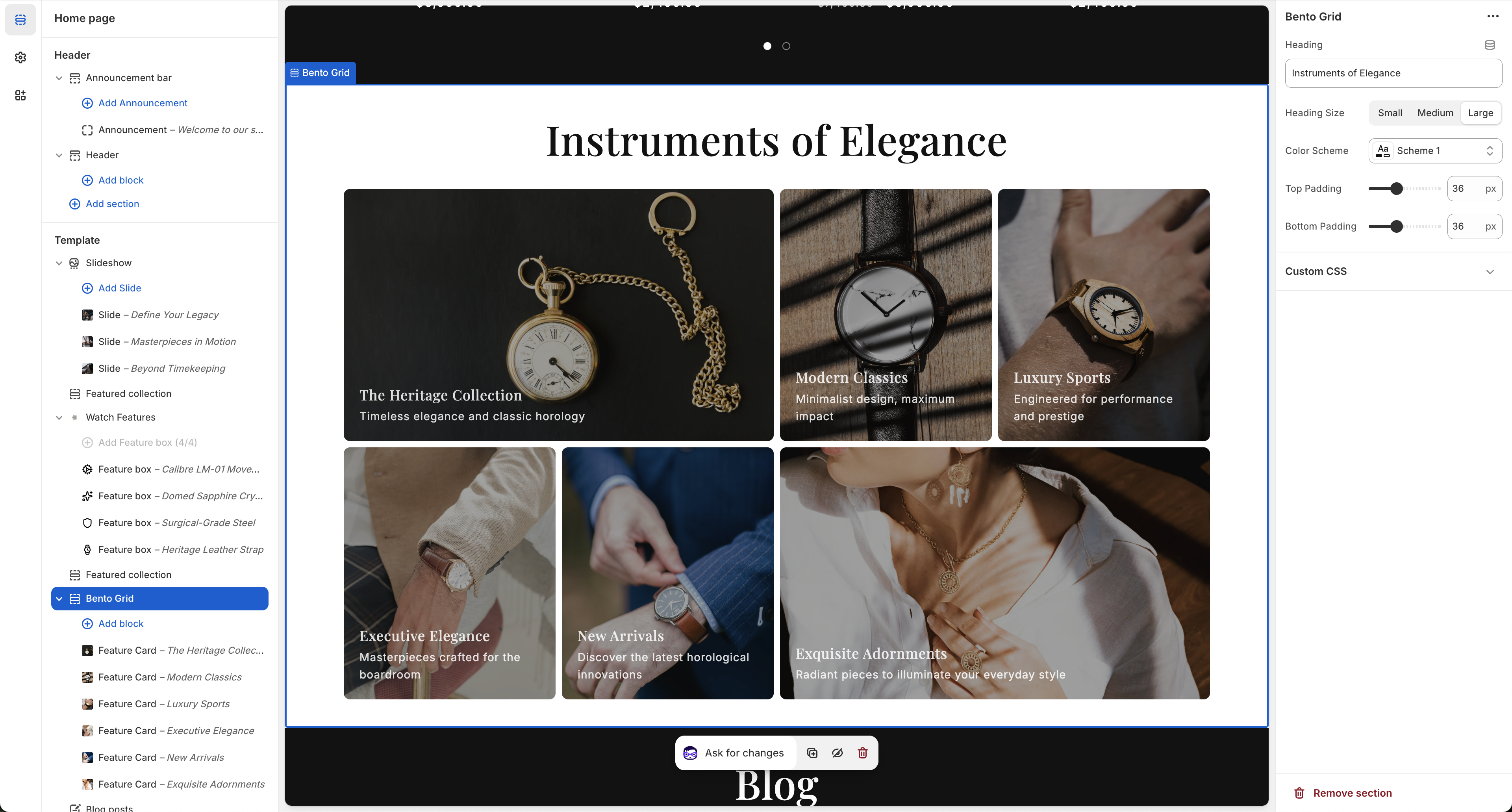
Bento Grid
Display your product categories, campaigns, or collections in a modern, asymmetric grid layout.
Settings
- Heading: Set the title for the bento grid section (e.g., "Instruments of Elegance").
- Heading Size: Adjust the main title size (Small, Medium, Large).
- Color Scheme: Select the color profile to adapt the background and text contrast.
Spacing & Padding
- Top Padding: Set the space above the bento grid section (e.g., 36px).
- Bottom Padding: Set the space below the section (e.g., 36px).
Blocks (Feature Cards)
You can populate the grid by adding individual "Feature Card" blocks. Each card can have its own image, title, description, and link.
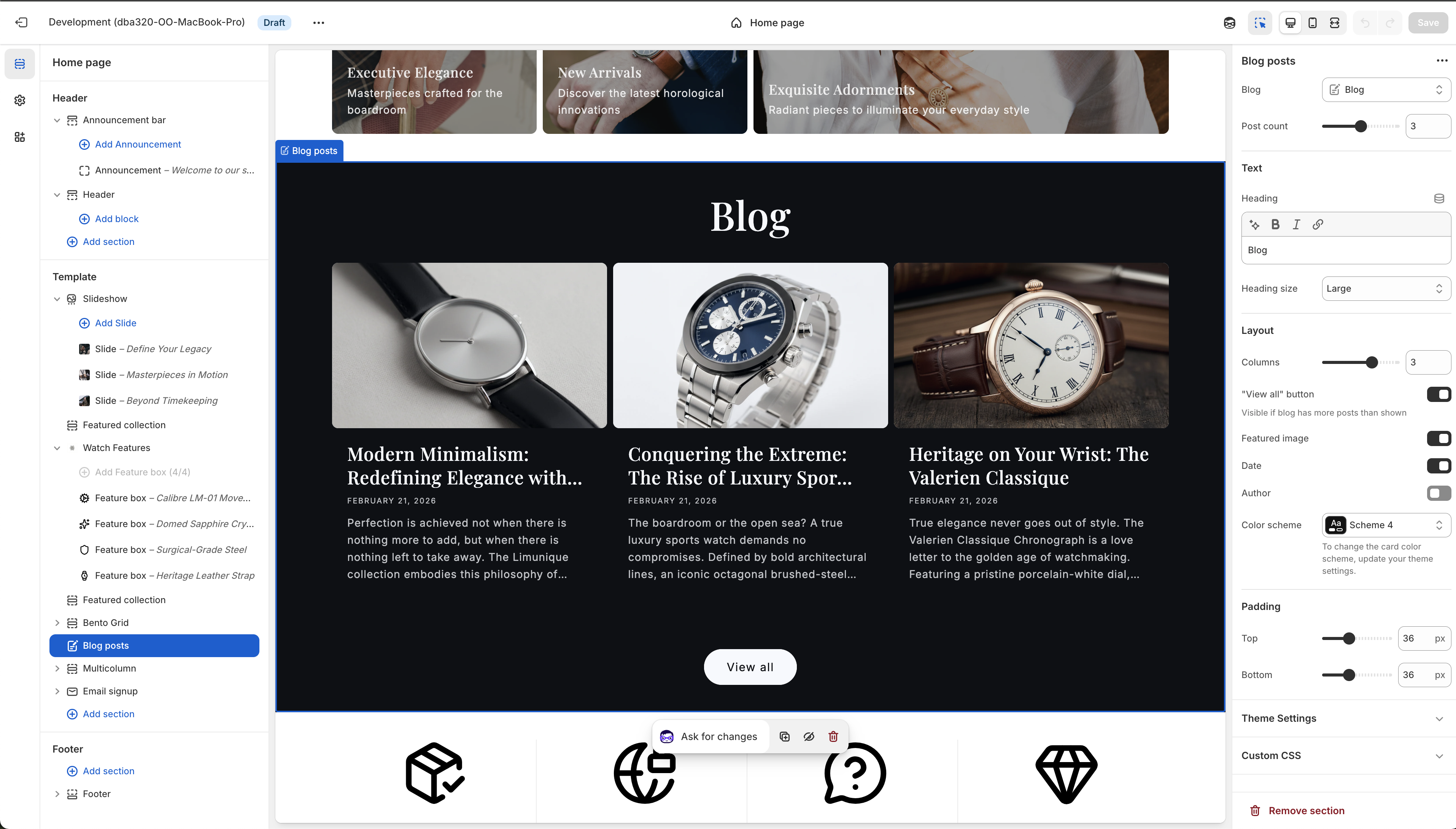
Blog Posts
Feature your latest articles, news, or guides on your pages.
Data source & Text
- Blog: Select which blog to display posts from.
- Post count: Limit the maximum number of posts to display.
- Heading: The main title of the section (e.g., "Blog").
- Heading size: Choose the display size of the heading (e.g., Large).
Layout
- Columns: Configure how many article cards appear side-by-side on desktop views.
- "View all" button: Show a button linking to the main blog page if there are more posts available.
- Featured image: Toggle the display of the article's featured image.
- Date / Author: Toggle the display of the publication date and author's name.
- Color scheme: Apply a unique background and text color scheme to this section.
Padding
- Top / Bottom Padding: Set the space above and below the section.
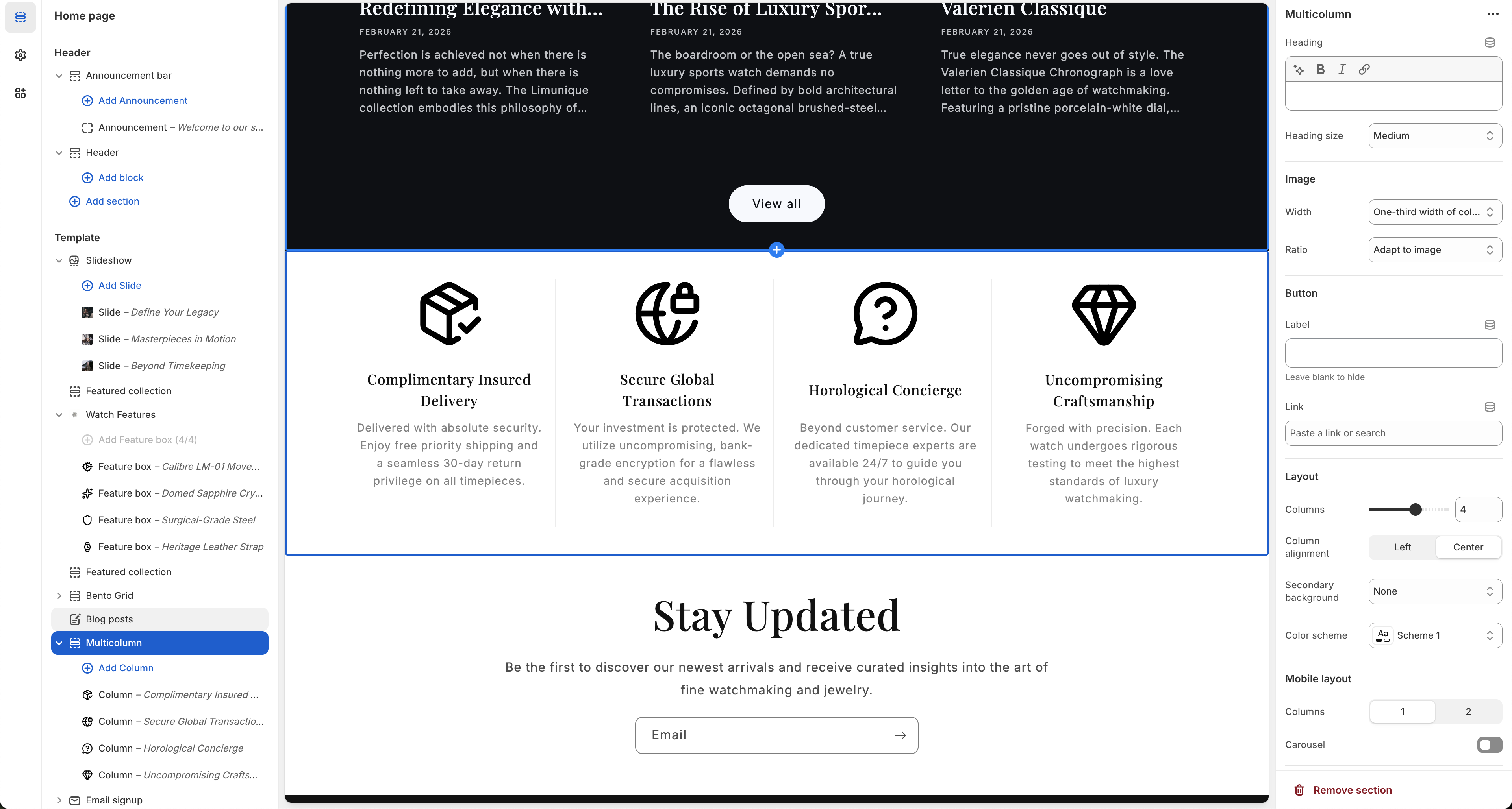
Multicolumn (Key Features)
Showcase your brand's core benefits, services, or key features using a multi-column layout.
Heading & Image
- Heading: Add an optional title above the multi-column layout.
- Heading size: Set the heading dimension (e.g., Medium).
- Image Width / Ratio: Adjust the size and aspect ratio of individual column images or icons (e.g., "One-third width of column", "Adapt to image").
Button & Layout
- Button: Add an optional call-to-action button at the bottom of the section.
- Columns: Set the number of columns displayed in the desktop view (e.g., 4).
- Column alignment: Choose between Center or Left alignment for the column content.
- Secondary background: Apply an alternative background color strictly to the column area.
- Color scheme: Set the global color theme for the entire section block.
Mobile Layout
- Columns: Define the number of columns to visibly stack on smaller screens (1 or 2).
- Carousel: Toggle horizontal swipeability on mobile devices instead of vertically stacking the columns.
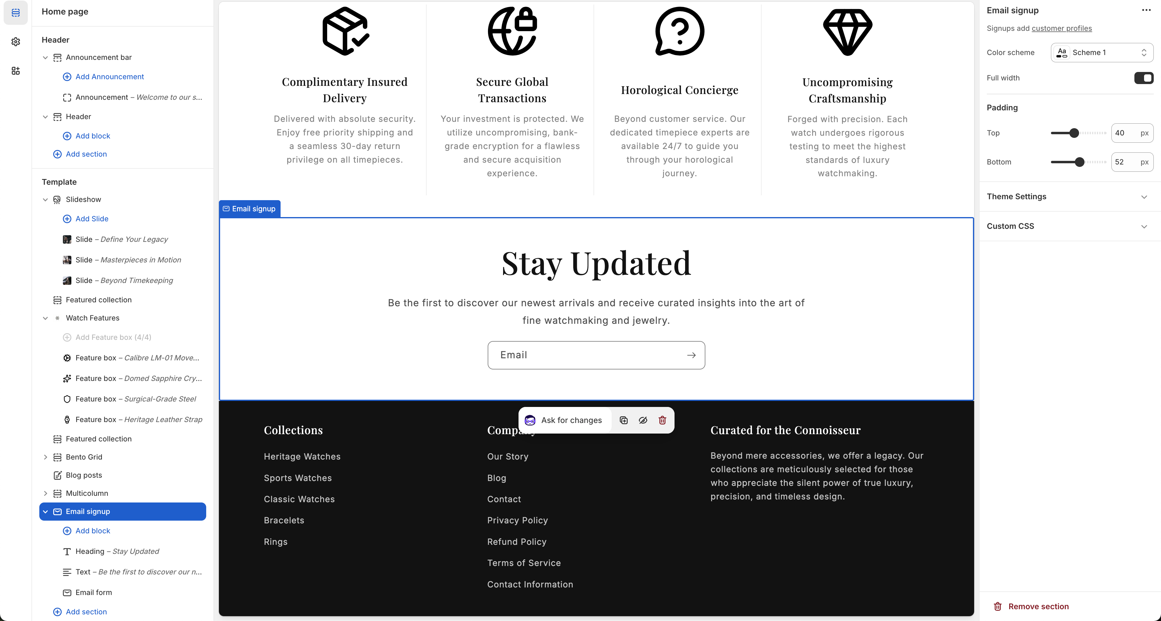
Email Signup
Encourage users to subscribe to your newsletter. Submitting this form adds users to your Shopify customer profiles.
Settings
- Color scheme: Apply a prominent color palette to draw attention to the subscription form.
- Full width: Toggle whether the background goes full edge-to-edge or remains contained.
Padding
- Top Padding: Add spacing above the email signup block (e.g., 40px).
- Bottom Padding: Add spacing below the given block (e.g., 52px).
Blocks
You can manage the individual components of this section by adding or removing the Heading, Text (subheading), and Email Form base blocks inside this section.
Footer
Customize the bottom area of your store including links, email signups, and utilities.
Color
- Color scheme: Select the color profile for the main footer area.
Email signup
- Email signup: Enable a dedicated newsletter subscription input within the footer.
- Heading: Provide a title for your signup area (e.g., "Subscribe to our emails").
Utilities
- Follow on Shop: Allow customers to follow your store on the Shop app (requires Shop Pay).
- Social media icons: Display linked icons to your brand's social networks.
- Country/region selector: Allow visitors to change their localized currency and location.
- Language selector: Allow users to toggle storefront languages.
- Payment method icons: Visually list acceptable payment methods like Visa, Mastercard, PayPal, etc.
- Policy links: Display links to important legal documents like Privacy Policy or Terms of Service.
Spacing & Padding
- Top margin: Control the space precisely above the entire footer block.
- Top / Bottom padding: Fine-tune internal vertical spacing for the content within the footer itself.
Colors
Customize the color palette to match your brand identity.
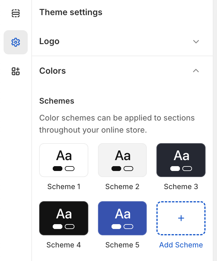
Color Schemes
Color schemes can be applied to sections throughout your online store.
- Pre-defined Schemes: The theme includes default color groupings (like Scheme 1 to Scheme 5) that handle interactions between background, text, and button colors for light, dark, and accent layouts.
- Add Scheme: You can construct completely custom color groupings by clicking the + Add Scheme button.
Typography
Configure the primary fonts and scaling for your store's text.
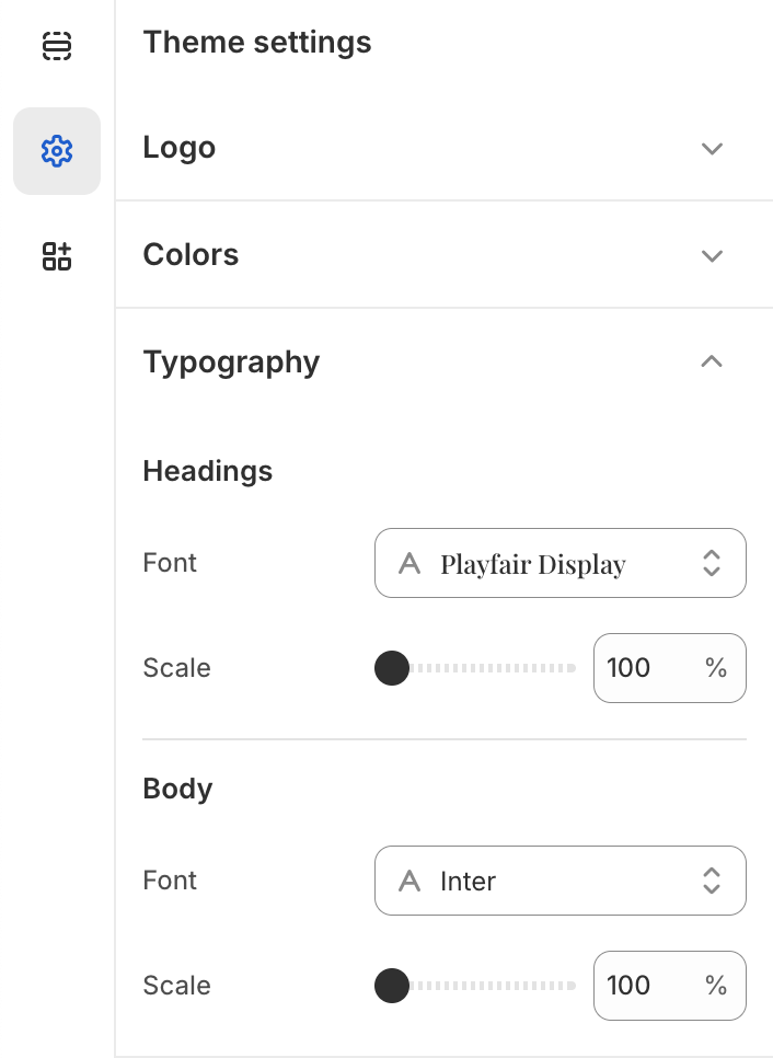
Headings
- Font: Select the typeface for all primary headings across your site (e.g., Playfair Display).
- Scale: Adjust the base size of headings globally using a percentage scale.
Body
- Font: Choose the typeface for regular paragraph and body text (e.g., Inter).
- Scale: Control the overall size scaling for body text elements.
Layout
Adjust the base structure and spacing of your storefront.
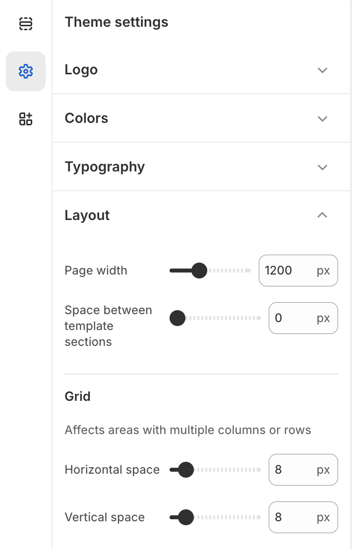
Layout Options
- Page width: Define the maximum width of your store's content area (e.g., 1200px).
- Space between template sections: Set the default vertical padding between different sections on your pages.
Grid
Affects areas with multiple columns or rows (like product grids and collections).
- Horizontal space: Control the gap between columns in grid layouts.
- Vertical space: Control the gap between rows in grid layouts.
Logo & Favicon
Manage your brand's core visuals and logo dimensions here.
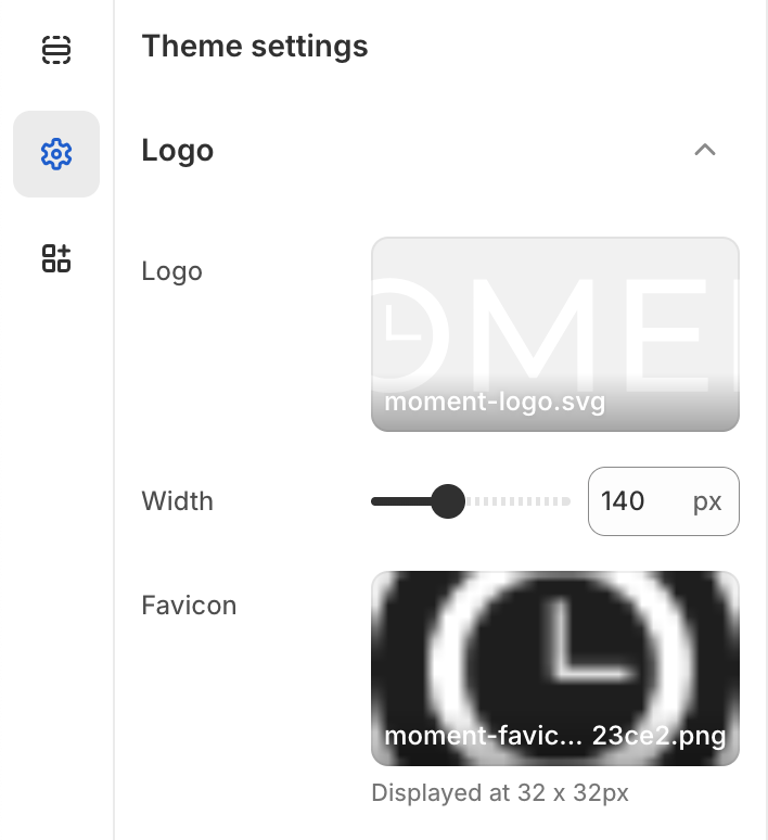
Logo
Add your store's main logo.
-
Image Upload: We recommend
uploading a transparent .png or .svg file (e.g.,
moment-logo.svg). - Width: You can adjust the horizontal size of your logo using the slider or by entering a manual pixel value (e.g., 140px).
Favicon
Set the small pictogram (site icon) that appears in the browser's top tab.
- Recommended Size: Use a 32 x 32 pixel, square-formatted image.
Frequently Asked Questions
Common questions and answers regarding the Moment theme and Shopify.
Is the Moment theme compatible with Online Store 2.0?
Yes, Moment is fully built for Shopify's Online Store 2.0 architecture. This means you can add, remove, and rearrange sections on every page (not just the homepage).
How do I update to the latest version of the theme?
When a new version is released, it will be available in the Shopify Theme Store. If you haven't made any edits to the underlying theme code, Shopify can automatically apply the update for you. Otherwise, you can download the latest version and migrate your settings.
How can I remove the "Powered by Shopify" text from the footer?
From your Shopify Admin, go to Online Store > Themes. Click the three dots (...) next to your theme and select Edit default theme content. Search for "Powered by Shopify" in the filter box and replace the text with a single space. Save your changes.
Can I use Moment for stores that don't sell watches or jewelry?
Absolutely. While Moment was designed with luxury goods and timepieces in mind, its versatile components and customizable color schemes make it an excellent choice for any brand seeking an elegant, high-end presentation.
Does the theme support multi-language and multi-currency?
Yes, the theme includes native selectors for both Language and Country/Region in the Header and Footer sections. You just need to have these features enabled and configured within your main Shopify settings (Settings > Markets / Settings > Languages).